Product Design + Brand Strategy
15+ years of experience. Los Angeles, CA.

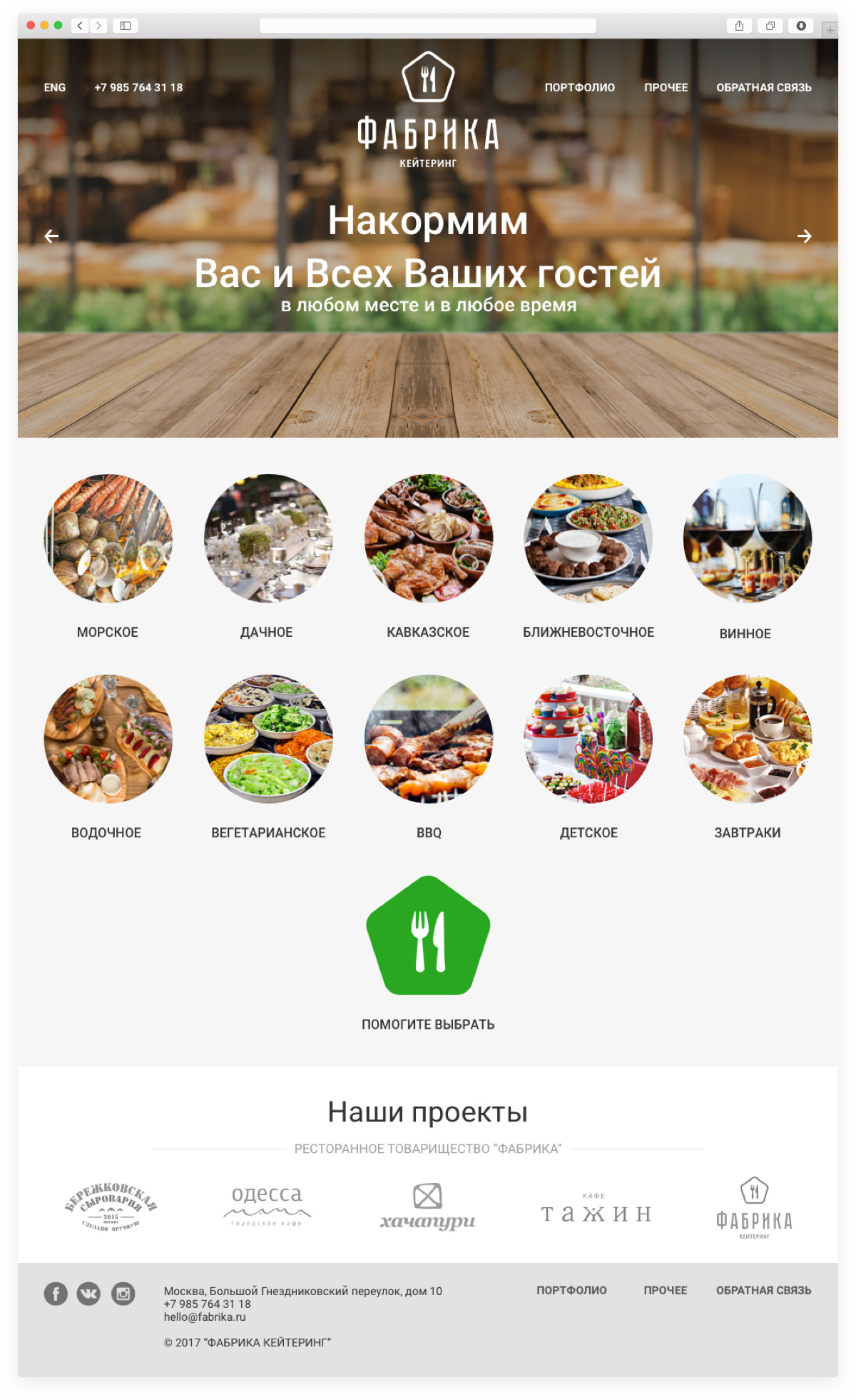
That same crazy group of friends at Fabrika Comradery, after opening a commercial kitchen for their restaurants, grew to such an extent that they decided to branch out to catering.
To maintain continuity with Fabrika Comradery, I used the same font as the parent company. The graphic here is made up of a pair of utensils (you know, the kind you eat with), both of which are bordered by a pentagon reminiscent of the State Quality Mark of the USSR. By using the best representations of Soviet visuals, the logo brings out deeply nostalgic feelings in the catering company’s clientele.
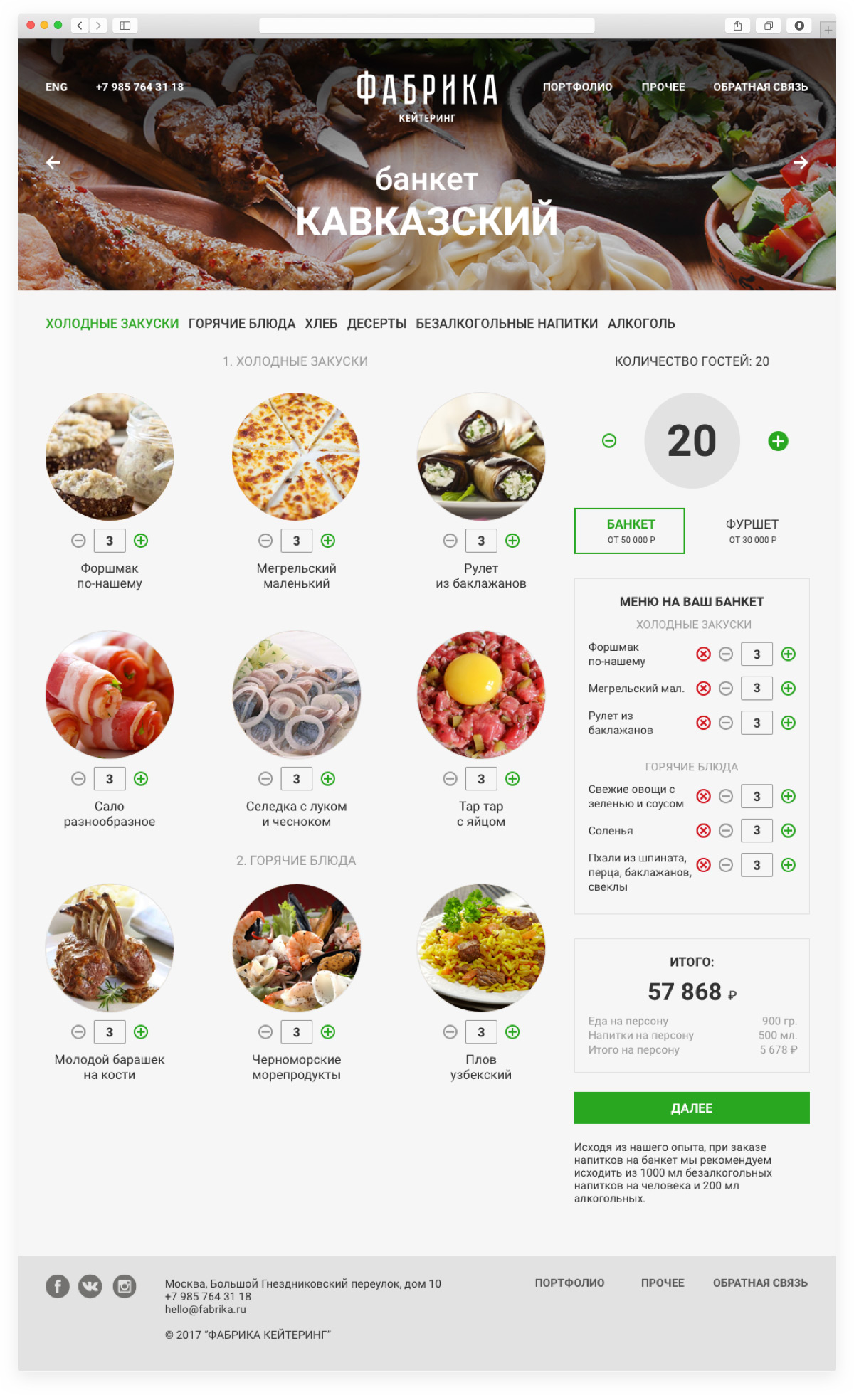
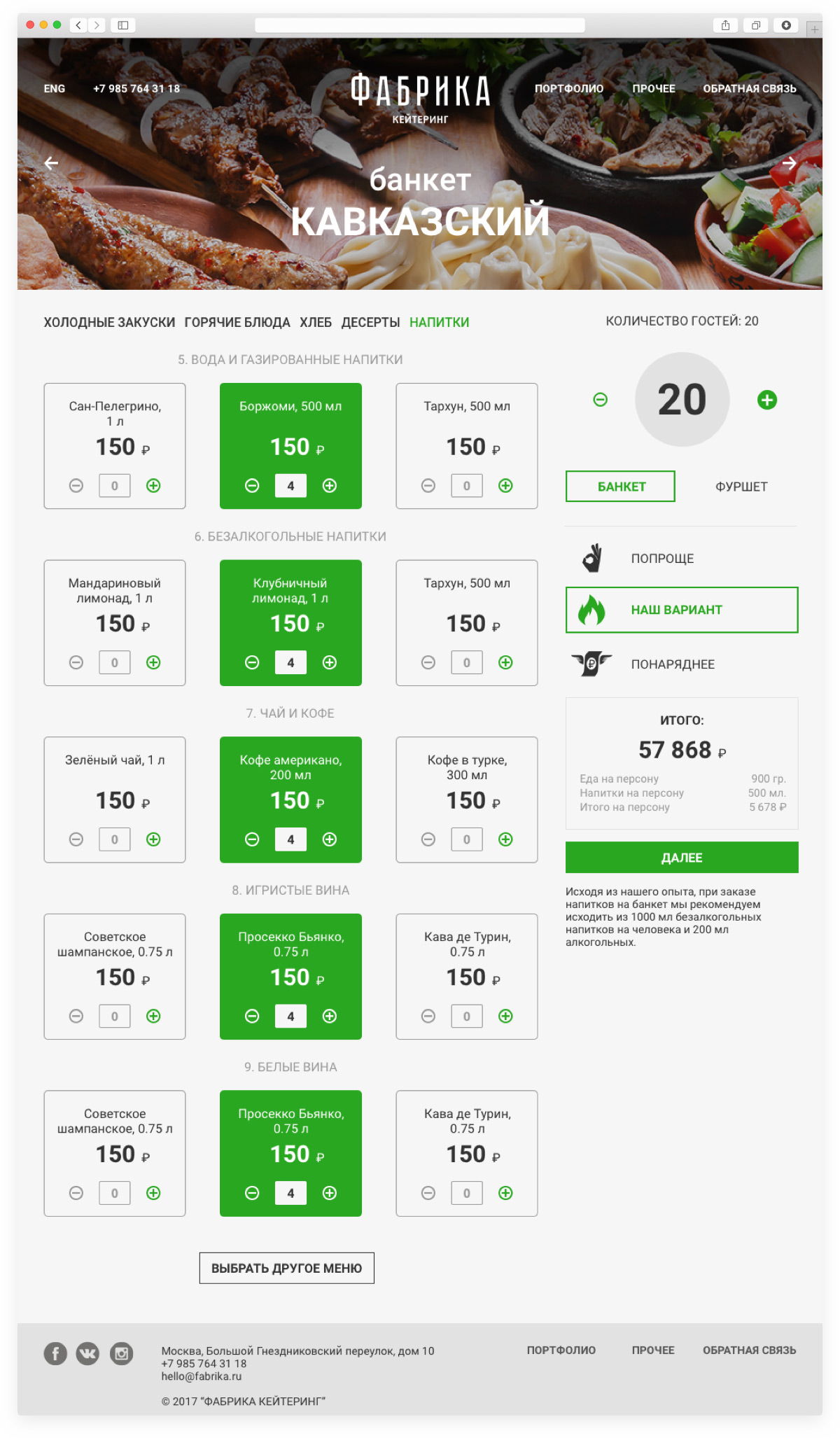
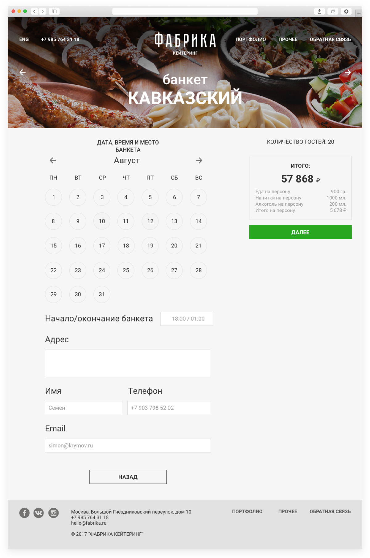
The second task in this project was to create a website. Functionally, the site works similar to an e-commerce store, but it has some unique features such as “Build your own Menu,” where you can order together various “incompatible” dishes like rice pilaf and steak tartare. We also developed a section called “Help Me Choose” where the client can figure out what he wants by using answering different questions with playful graphics.