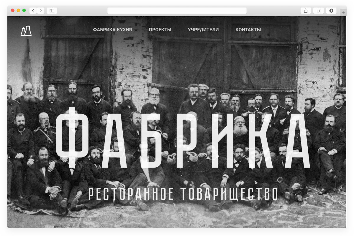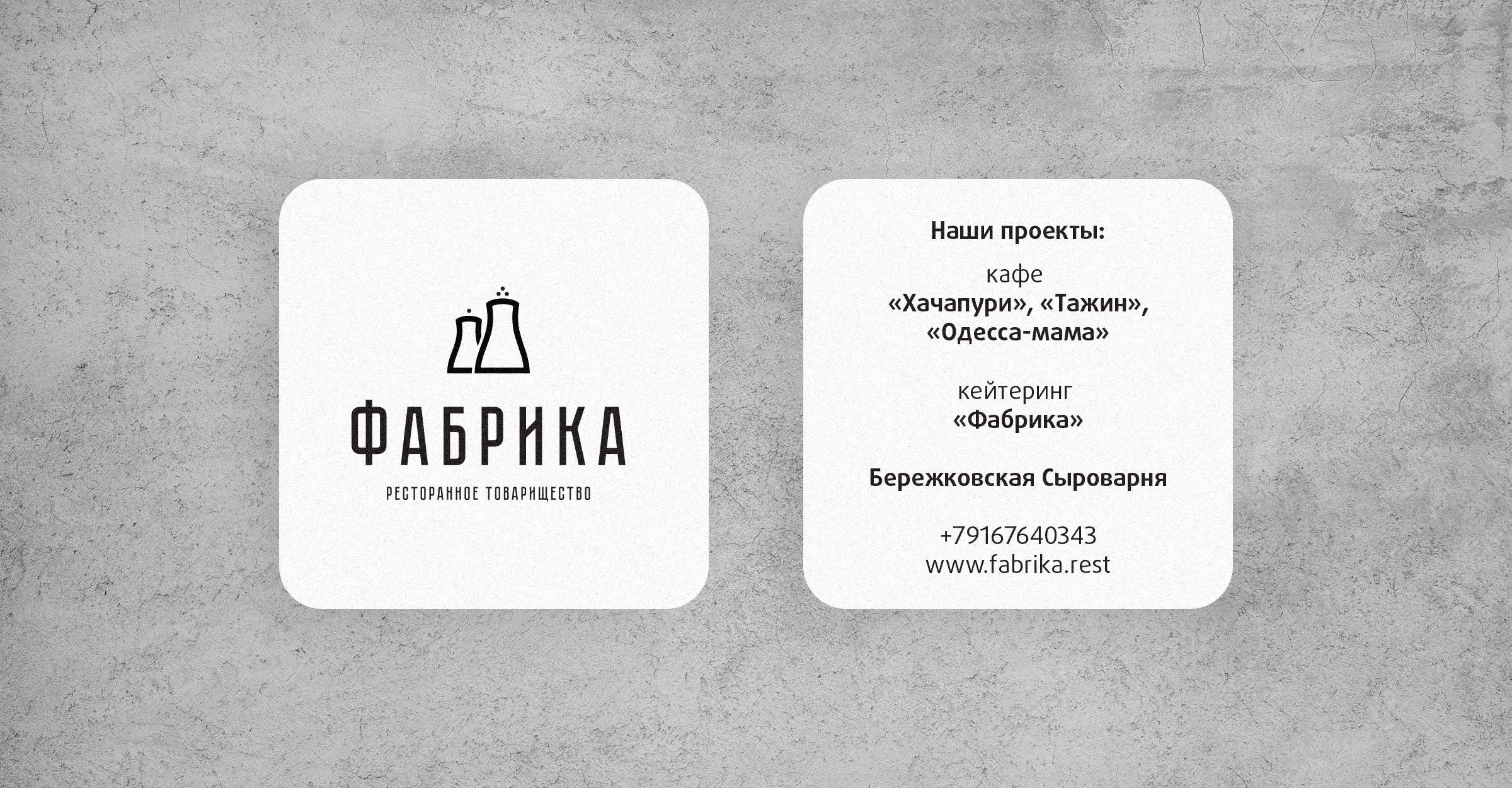
Some close colleagues of mine in the restaurant sector decided to form a corporation in order to make delicious food faster, as well as build better restaurants. After deliberating a bit on the name, they decided on FABRIKA as a symbol of constant production. I drew an awesome logo for them — salt and pepper shakers that also resembled factory smokestacks. I also used an old Soviet font as they wanted to position themselves as a “comradery.” Aside from the logo, I also provided brand identity and a landing page.

