The target audience of the app if for anyone who enjoys fishing.
This is both for casual and competitive fisherman.
Some high level desired client features include:
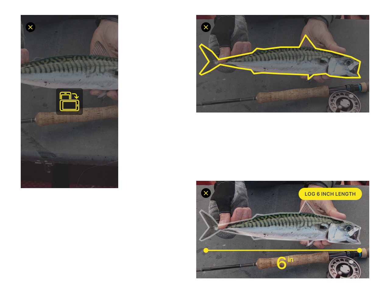
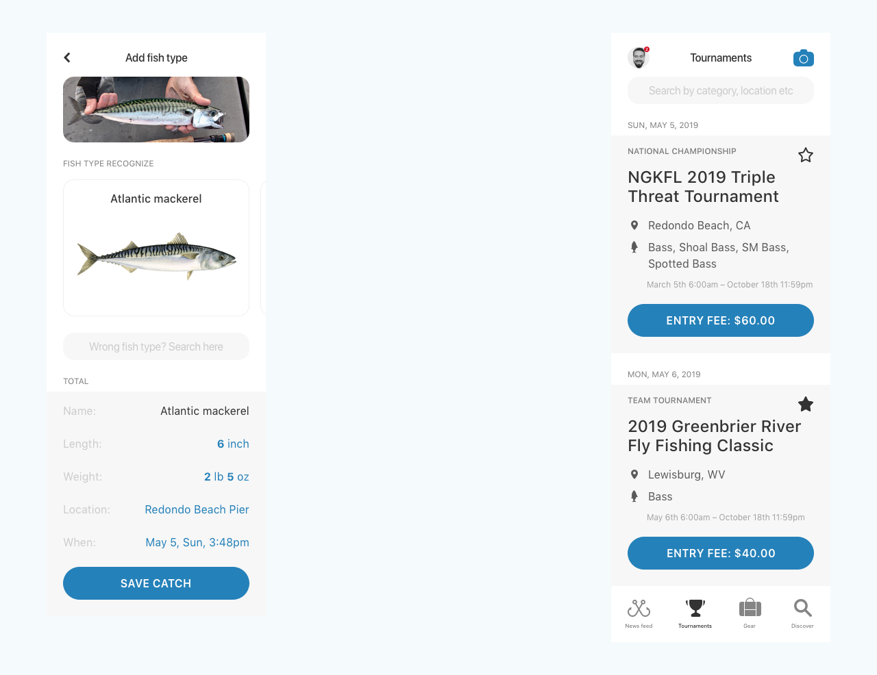
· Take a picture and measure the fish (per type)
· Tournaments between fisherman, multiple different tournament types
· Rewards for winning the tournament
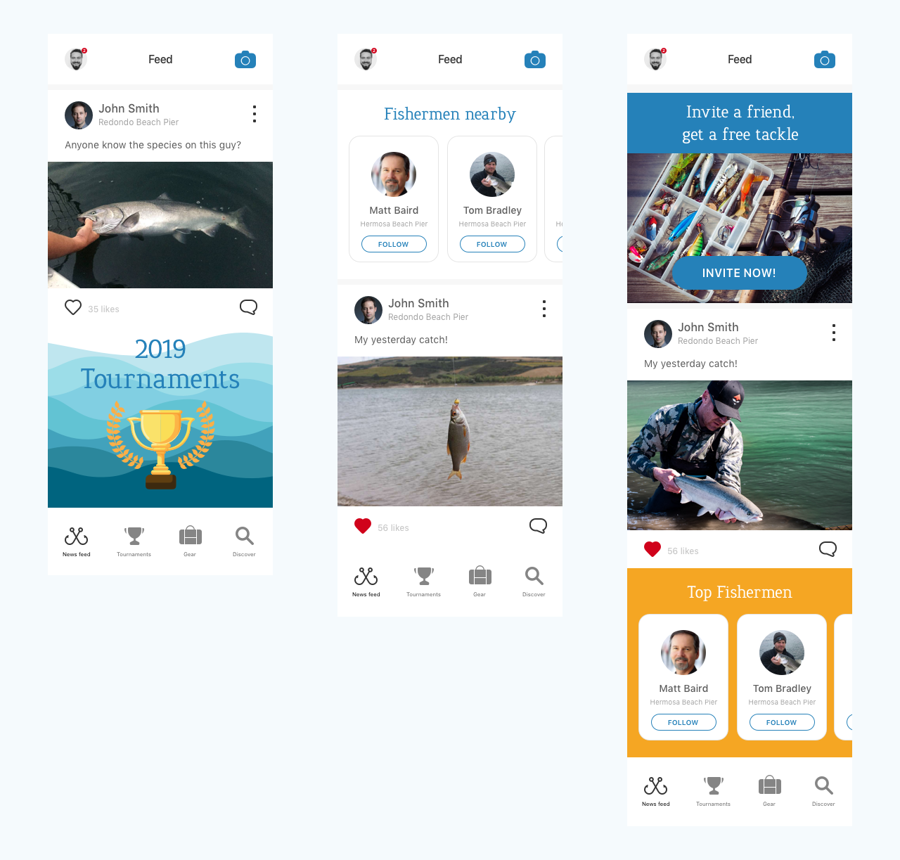
· News feed of trending tournaments and top fisherman
· Automatic fish measuring (AR)
· User profile with uploaded catches
· Following of other users
· Brand sponsorship capabilities
· On board analytics
· In-app advertising
Questions:
1) How would you think about ideating for an app icon? Provide your thought process and what the outcome of each step would be.
2) Assuming the app wouldn’t have many users to begin with, how would think of the UX for “News feed of trending tournaments and top fisherman” requirement?
(e.g. probably an Instagram alike feed would feel extremely repetitive due to lack of content). Please suggest a few ideas for that UX.
3) How you would design the “Take a picture and measure the fish (per type) and the tournament home screen? Please provide some high fidelity examples.
Design Contest Result:
Icons
App News Feed

AR Fish Measure

Fish "Shazam" + Tournaments
