NexTravel is a corporate travel management platform built to give businesses true ownership over their end-to-end booking experience.
I joined NexTravel in 2019. My first project was to design Mobile App for Business travel management. We had legacy iOS app developed in 2015, but it was non-native iOS.
First of all I started with research travel market and analyze competitors. I did whole booking process (flight, hotels, car rental) on mostly all major travel websites (Expedia, boooking.com, Kayak) and certain business travel products (TripActions, lola.com). I did a lot of notices and screenshots during this research, which helped me later to create my own ideas and solutions.
Then I researched how travel policy management works on legacy website and competitor ones to clearly understand the whole product.
Whenever I start any product design, I always put myself in the position of the user and from this perspective I am able to understand how to make perfect user-centric design. That’s why for example I put flight time and flight price on the same line.
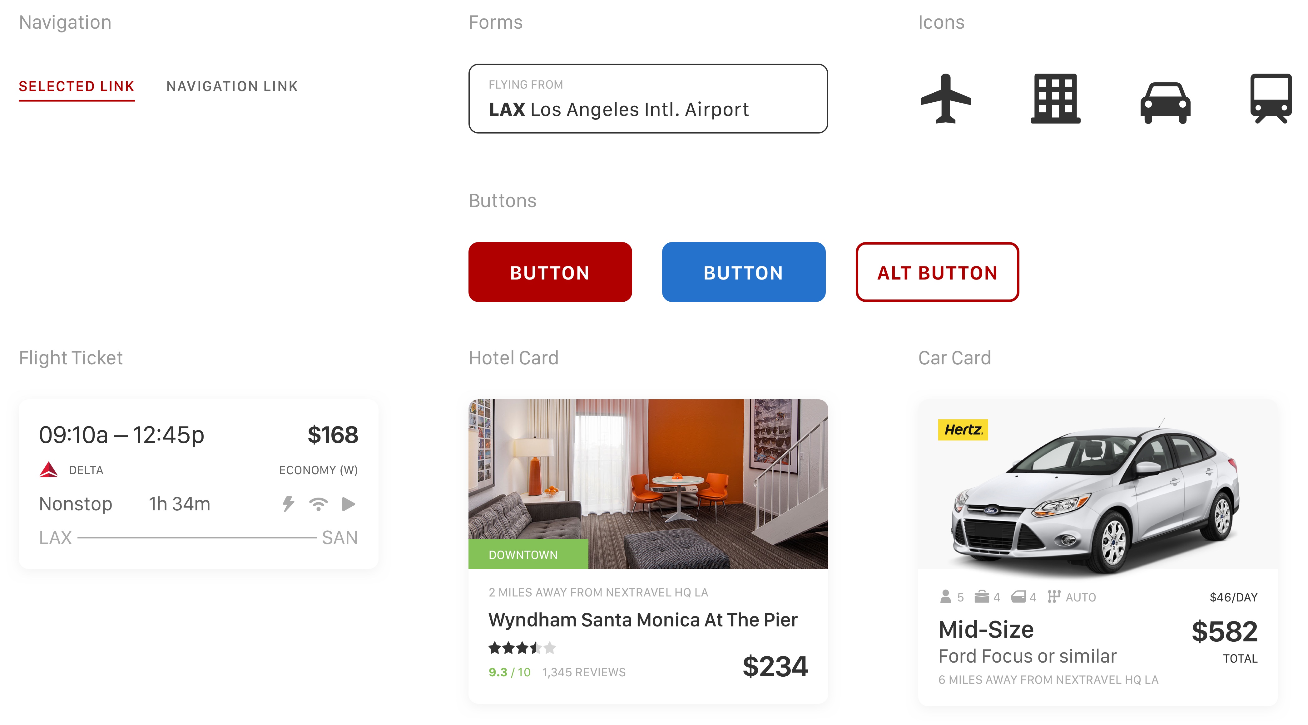
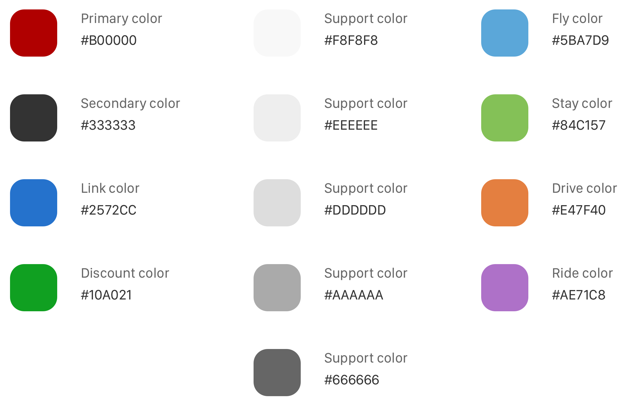
I started from building Design System first. And Designed System must be organized from the beginning to help any other designer easily work in it. Typography – I found really cool font pairs, named it all and store in Sketch library. Same for Colors, then buttons and forms stored in Symbols with properly resizing abilities. As for forms, I love to keep labels inside it – user always know what to do. Every dimension is just multiplication of 8, sometimes 4. Then, I started design icons, which must fit in square for perfect implementation.
Elements
Colors
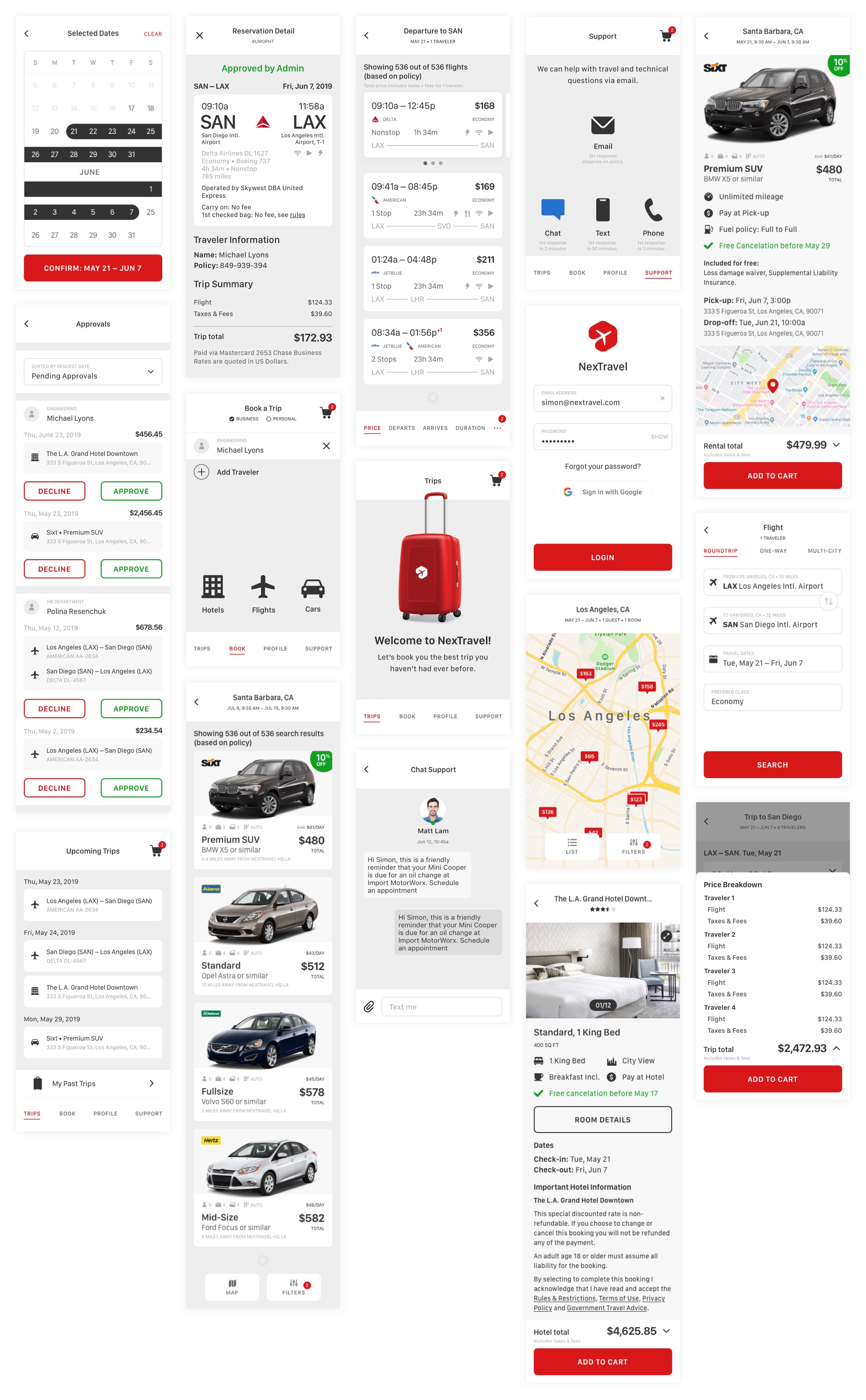
It took me 6 weeks to design the whole app with prototyping in InVision and export project to Zeplin for Developers.
App design
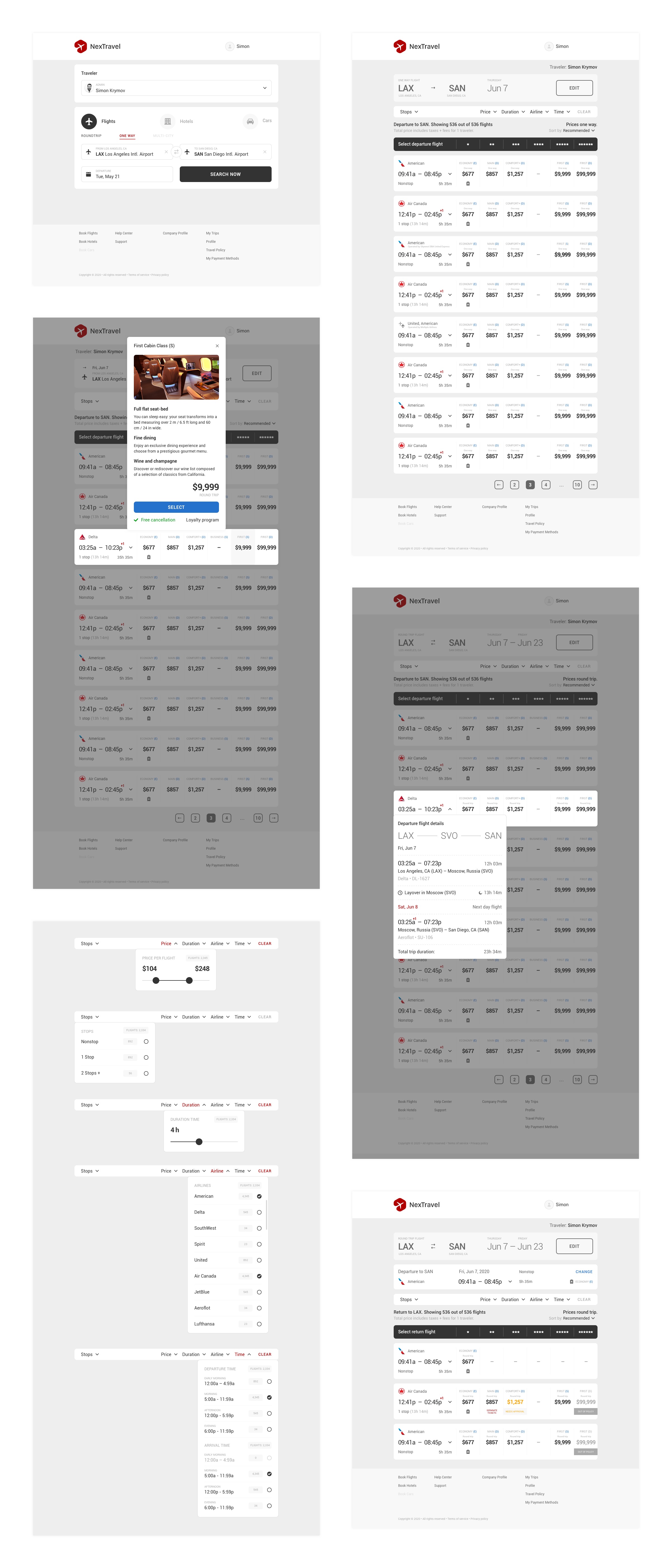
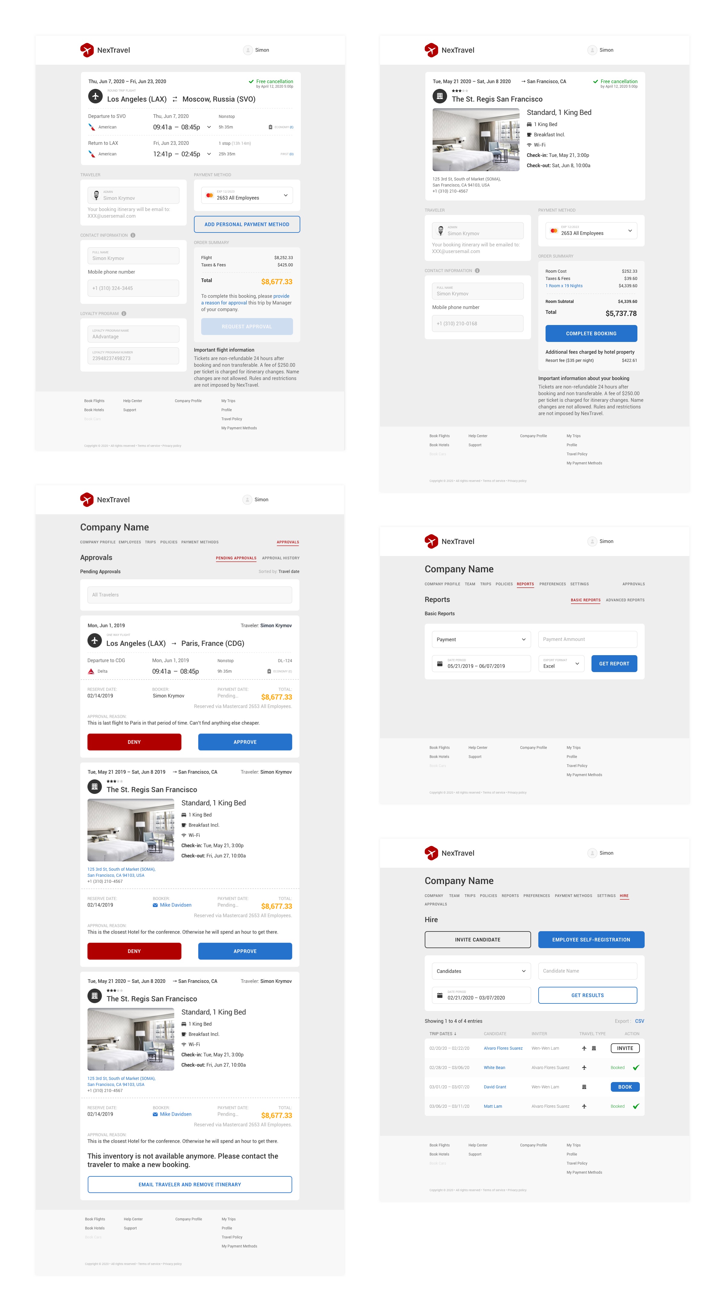
Desktop Product design was the complex one, cause it’s not only traditional booking processes, but also powerful travel management system with flexible policy builder and reports.
I offered to eliminate “cart” at Desktop and allow user to checkout only one travel at a time – it helped to reduced a lot of errors during checkout (used several GDS and possible processing payment errors on each GDS). This ten times increased user checkouts and reduced support calls.
While I was designing policy system I created an organization based rules and actions, what allowed company admins create more flexible rules and keep managers happy.
In Travel and Financial Reports I offered to get reports in excel file, instead of web-based sheets, cause it’s much more easy for user to work with file (searching, sorting, summaries). And I designed minimalistic form based on date period (cause everything happens in time – travels, transactions, cancellations), travel type, payment etc. This is also saved a lot of time for company admins.
Desktop product design


Later it was time to refresh landing page design. I made it modern, clean and minimalistic. Used InVision for prototyping to present it for investors.
Besides this, I did small rebranding, designed a lot of internal and external presentations, web and printed case studies for Business, A/B tests for Client onboarding.
Landing page
